Overview
Nowadays, the Growth of Mobile users is very high compared to desktop users. Mobile applications can be one of the best ways to keep your consumers engaged with your brand as they are on the move. In five years, the mobile generation could have more buying power than all other demographics
Steps for Mobile designing
Wireframing
So, this is the first step for design, it’s better to start with a rough sketch of what we are going to do.
Designing in Photoshop
Dimensions and Resolutions
Dimension for iphone 3.0
Screen size: 320 x 480 px
Resolution: 163ppi (pixel per inch)
Dimension for iphone 4.0
Screen size: 640 x 960 px
Resolution: 326ppi (pixel per inch)
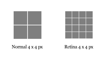
Retina Display
Retina Display is a brand name used by Apple for liquid crystal displays which they claim have a high enough pixel density that the human eye is unable to notice pixelation at a typical viewing distance.
So, it’s better to designing for the 320 x 480px screen size and then sizing up to 640 x 960px is the better option. Designing for the smallest screen size eliminates the disappointment of losing details when a design must be sized down later.
Saving for Retina
Normal: Icon.png
Retina: [email protected]
Mobile GUI – UI Elements
There are plenty of resources available to help you get acquainted with the various iPhone and iPad interface elements. Even if we are going to create customized interfaces, these templates are helpful in getting a baseline grid or dimensions of on-screen elements properly proportioned
iPhone GUI
http://www.teehanlax.com/blog/2010/06/14/iphone-gui-psd-v4/
iPhone GUI retina
http://www.teehanlax.com/blog/2010/08/12/iphone-4-gui-psd-retina-display/
IPhone Stencil
http://graffletopia.com/stencils/413
iPhone UI Vector
http://www.mercuryintermedia.com/blog/index.php/2009/03/iphone-ui-vector-elements
Standard UI Format of Apple
Apple Suggest the above format for applications, they are also providing the UI’s in XCode (Mac editor for creating Mobile apps). One of the reasons is Apple wants the developers to develop an App without the support of a Designer.
Use Vector
Use Shape layers because they have vector capability. So that the image will not blurry in larger Screens
Link/Buttons
In Mobile, we are not using a Mouse. We are using our hand as mouse. So design a link or button should be accessible with finger. So the minimum dimensions for a link is 44 x 44 px as calculated with our exact finger tip size. If we design multiple buttons as we do in Web, it will be very difficult for users to touch the exact point.
Screen Size and Landscape Modes
You should also keep in mind that there is lots of mobiles are in the market and all of them have different screen size, also there is a landscape option for every screen. As we know that we cannot design for all screens, so our design should be compatible on familiar Screens and Landscape modes.
File Format
All graphical assets that will be used to build an app are exported in Portable Network Graphics (.png) format. Technically, the iPhone can display other file formats as well, but PNG files are automatically optimized by the iOS SDK, and consequently should be the preferred format.
Slicing
Slice up all of the files to ensure all images are sliced out properly to save huge time later. We should give proper naming for all images like prefixing “btn” for all buttons. Also there will be an affix @2x for retina images.
Creating Icons
For iTunes: 512 * 512 px
For iPhone 3: 57 * 57 px
For iPhone 4: 114 * 114 px
Conclusion
The mobile Web is different, and may be daunting, but the design process is similar enough for Web designers to ease into mobile design. Designing the perfect mobile website is an impossible task even for experts, but using an iterative user-centered design process can help create the best experience for our users with their help.
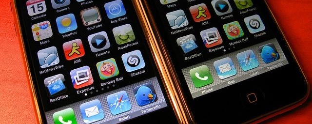
Featured Image Credit : Flickr by Ricky Romero
