In plain English minimalism can be described as an art movement striving towards simplicity while opposing abstract elements. Since its inception in the mid–20th century, the movement has spread across all art forms, from visual arts to music, leaving behind some really significant and, sometimes even controversial pieces of art. And it was time that it takes over the web as well.
The Mantra of Minimalism
When you come to think about it, this makes perfect sense in a world where people are bombarded with tons of information on a daily basis. But what does it all mean for web design? Well, you are on a website right now, aren’t you? The information you get from the internet come in a form of a web page, application or whatever, and web designers have the ability, nay, the power, to choose what to show you and in which form.
Many influential companies have embraced the minimalist approach with their brand messaging and appearance. This can’t be a coincidence. They simply know that minimalism works due to its natural efficiency. Instead of showing users where the door to a specific solution is, minimalist approach opens the door and encourages the user to walk through them. Check Google and Apple for inspiration.
![]()
source:https://commons.wikimedia.org
In a way, less is more when it comes to design which makes minimalism the obvious method for designers to utilize. It seeks to remove all the unnecessary elements and content thus simplifying interfaces and making the user interaction with the content as frictionless as possible.
Is Minimalism Just Another Word for Simplicity in Web Design?
If you think that minimalism is just a fancy word for simple then you couldn’t be more correct. Simple describes a state of something deprived of excess material, something basic with no surplus. Minimalism in its core is exactly the same. The only difference is that minimalist design sounds much better than simple design, so let all the artists and designers have this one, okay?
The only big mystery and mastery now are achieving this minimalism we’ve been talking about. You can do this by going through the elements systematically, kicking them out one after the other. If the design works without a specific element it means that it is not absolutely required and you can get rid of it. Limit the resources – reduce the number of colors, fonts, and sizes, limit choices and give it only one purpose with one call to action.
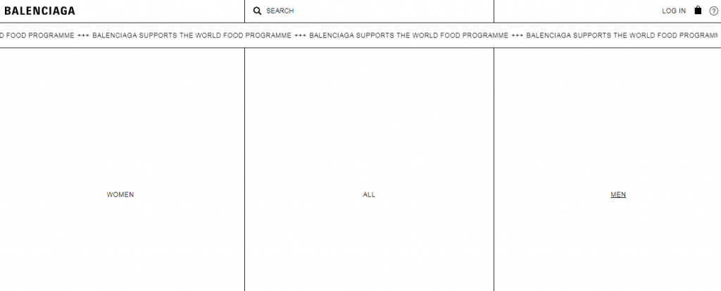
Source: https://www.balenciaga.com
Should You Go Minimalist With Your Design?
Before even thinking about taking on a minimalist approach to design as a brand or as a company, you have to think about the end user. You have to ask yourself who the real user is, what are his interests, and guide him towards completing the desired outcome – whether this is buying a product, ordering a service, making a subscription, donating to a cause, or just hearing you out. The main thing to look at is how the design will resonate with the audience and the message will be conveyed.
It all starts with a good logo. A clear and memorable visualization that conveys your brand’s mission and vision, your goals and messaging. This is the first thing the end user interacts with and is used to achieve cross-channel recognition at any point of the users’ journey. And with minimal design, it dictates the color scheme and is a primary visual in any design. So, if this sounds like a lot, then maybe the best way to start is by consulting a logo design and branding agency, which will do all the research, propose a solution and see the whole job through.
A few takeaways
The best thing about minimalist design is that you simply won’t have to waste your time on useless distractions with no practical purpose or goal. In addition, this will lead to fewer problems, since there are fewer parts that can potentially break. Fewer parts further lead to faster loading times and faster loading times mean lower bounce rates since people don’t have the time to wait for your overcrowded poorly designed website to load.
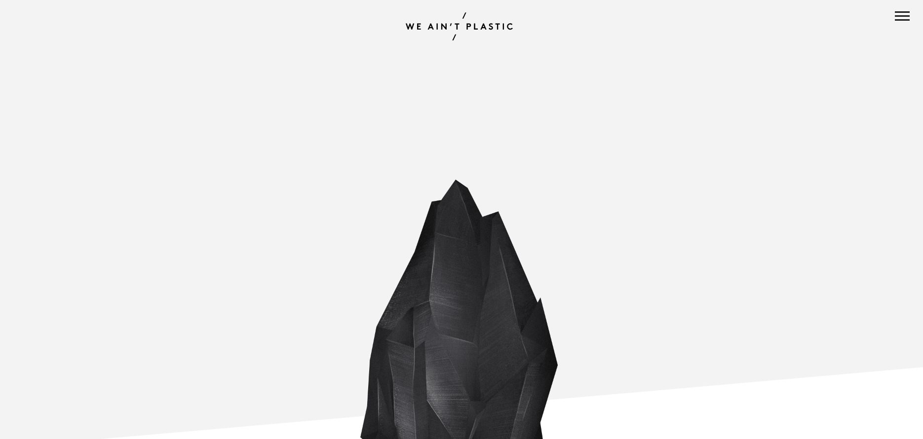
If there is anything wrong with minimalism it’s that sometimes it can be pushed too far. A blue canvas doesn’t make for a great piece of art in my mind, just like a website with restricted functionality due to simplicity doesn’t make for a good web design. If you aren’t careful, you can easily cross the line and mess up the messaging and drive the user away from achieving the desired outcome. Minimalism might not be the best solution when trying to communicate a complex message. Sometimes, when you can’t find what you need on a website, less is not more.
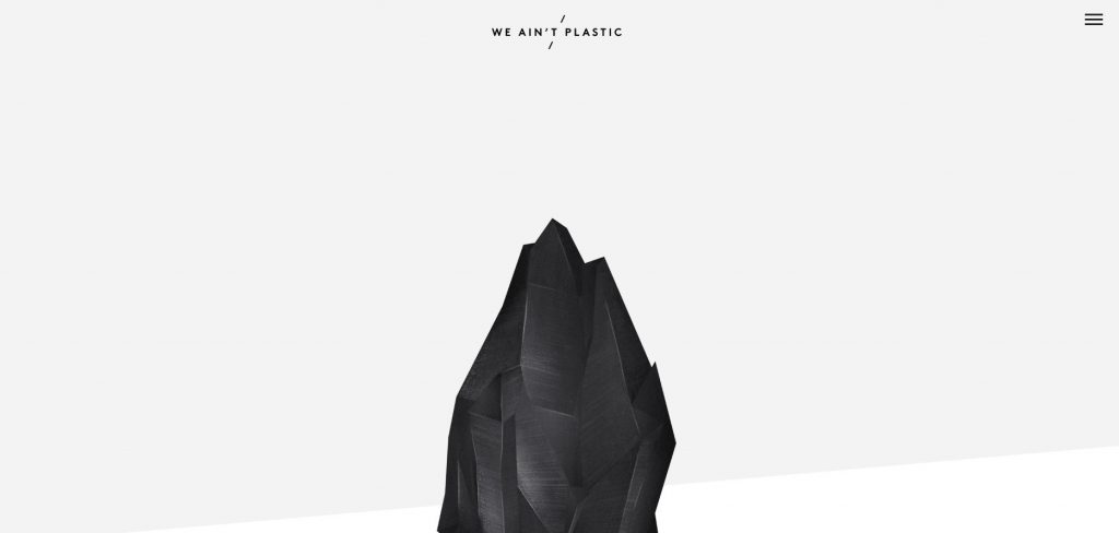
source: http://weaintplastic.com/
Final Words
All in all, everything comes down to you and what kind of a designer you are. If you are only getting started you may be tempted to try and follow trends and use elements only because they look nice and appealing. You might be trying to hide behind the decoration and bling, but in reality, all you have to do is embrace the fact that you suck.
The part where you don’t actually suck comes when constantly testing the hypothesis through surveys and trial and error. User-centered design, where you take on an investigative and engineering approach, where you listen to and track the users and ways in which they communicate and interact with the design solution is your way to achieve minimalism greatness on the web.